Of all your company’s assets, few are more valuable than your logo. In the minds of the public, your logo is your organization.
Think about it. When you hear words like Coca-Cola, Google, Amazon or Apple, what is the first thing that comes to mind? Odds are, it’s the company’s logo.
Given the importance of a good logo to an organization’s success, we’re amazed at the number of poorly designed or poorly implemented logos we see. This being the case, here are our choices for the most epic fails in logo design.
1 Poor font choices
Most logos incorporate the name of the organization they represent. This portion of the overall logo is called the logotype. It’s something that must be distinct and recognizable by itself.
The last thing you want to do for your logotype is use a common typeface such as Arial or, worse, Times.
By itself, this sort of “logotype” is hardly distinct. It looks instead as though someone just typed your company name using the same font they would to compose an email.
You want to choose a logotype font that is readable yet distinct. There is a whole category of typefaces called display fonts which are good for this. Just avoid something overly complex and, thus, hard to read — especially when reduced in size to a thumbnail.
You also want to avoid most serif typefaces, such as Times. Serif typefaces are those in which the letters have “little hats and feet.” In smaller sizes, these features tend to disappear.
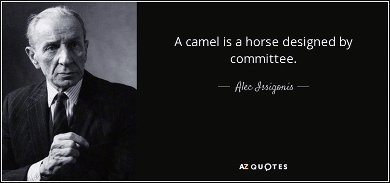
2 Symbolism run amok
Consider this, one of the many versions of the English coat of arms:
It incorporates over a dozen different symbolic elements, some going back to the days of Richard the Lionheart and Robert the Bruce. As an example of the art of heraldry, it’s fine. As a corporate logo, it would suck mightily. Why? Too much “stuff.”
Unfortunately, too many would-be logo designers think their work must embody all of the company’s achievements and values. This is a fool’s errand.
An effective logomark might reflect a single aspect of the organization, such as the AT&T globe. If you try to do more than this, however, your logo will fail. Here are two examples.
On the left, we have the logo for CDA Technical Institute. It strives to incorporate the company’s global reach, its core values and, of course, the fact CDA stands for Commercial Diving Academy.
The logo fails in several respects, all of which we will discuss in this article. Chief among them, however, is the fact it is hard to read and, if any smaller than what you see here, becomes a jumbled mass of fuzzy pixels.
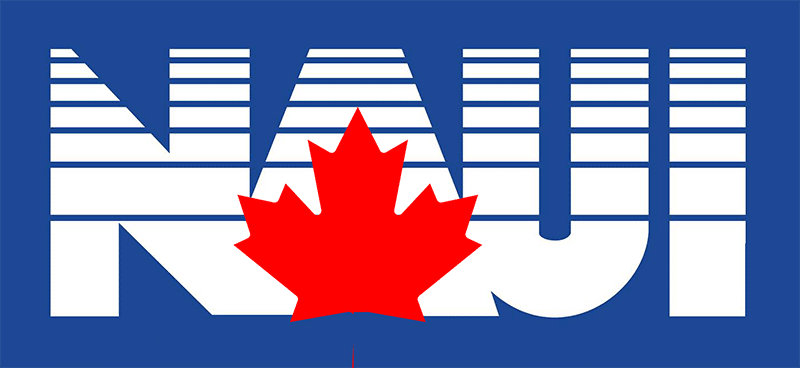
Then we have the logo for the National Association of Underwater Instructors (NAUI). It is a testament to the adage that:
Case in point:
The logo originated with the organization’s Canadian affiliate over 40 years ago. It was the letters as you see them here, except that a bright red Canadian maple leaf was superimposed over the A. It looked good and was quite cutting edge for the time.
Not to be outdone, however, the parent organization in the USA replaced the maple leaf with a stylized American eagle. Again, the result looked good and all would have been fine had they stopped right there.
You need to understand, at this point, that NAUI is a nonprofit organization run by an elected Board of Directors — most of whom seemed to think this fact made them experts in graphic design.
The first issue the NAUI higher-ups felt they had to address was the fact NAUI is an international organization rather than a national one. The solution? Drop both the maple leaf and the eagle. The result was the plain-Jane version of the logotype you see above. Not especially riveting, to say the least.
But his was not enough. Someone insisted that they had to add the edge of a globe with a rising sun peeking over the horizon. (Given how the organization’s market share has fallen in recent years, maybe it’s a setting sun.) And, if this was not obvious enough, they had to put the word Worldwide below this. Now things were getting really cluttered.
However, as the late Billy Mays would say, “But wait! There’s more.” The next addition was the slogan Dive Safety Through Education. Because excessive verbiage always makes a logo more effective…right?
Finally, someone expressed concern that nothing in the resulting logo made it obvious that NAUI was a diving organization. The solution? Just slap a diver over the globe.
The result is yet another jumbled mass of conflicting symbology that’s hard to read if reproduced any smaller than what you see here.
3 Unintentionally suggestive
What comes to mind when you see this logo? Is it an adolescent couple dancing? Or is it something else?
Among the greatest pitfalls in logo design is coming up with something that is unintentionally suggestive. Compounding this is the fact the design team is so deeply involved that they fail to see the problem.
Never make a logo design public until you’ve had several other people who were not involved in the design process look at it. This way, if you have unintentionally created logo porn, there is a better chance someone will catch it.
By the way, if you would like to see more examples of this type of logo disaster, check out 20 Worst Logo Design Fails.
4 Type in a circle
When is it a good idea to wrap type in a circle around your logomark? That’s easy: Never. There are three problems with doing so:
Type arrayed in a circle is hard to read.
Circular type is, by necessity, small and therefore even harder to read.
When the resulting logo is reduced to thumbnail size on digital media, the entire logo becomes unrecognizable.
The original Starbucks logo was among the least offensive in this regard. However, in 2013, Starbucks saw the light and went for the simpler logo you see on the right.
Here is a more typical example of the problems inherent in arranging type in a circle:
The type-in-a-circle issue is but one of several problems with this logo. But, in fairness, it was probably designed by 7th- and 8th-graders, so we should cut them some slack.
However, if you put type in a circle around your logomark, you risk having people assume you had a 13-year-old design it as well.
5 Inconsistent color
Color is every bit as important to the success of your logo as any other element. Unfortunately, not everyone understands this.
Imagine if each McDonald’s manager was allowed to use any color combination he wanted for the not-so-Golden Arches. The logo would instantly lose much of its value.
Successful companies invariably have a logo style guide that outlines the precise colors to be used in both digital and print media. Your company may not be as big as McDonald’s, but you should do the same.
6 Fails in black and white
Raymond Loewy was very possibly the greatest designer of the 20th Century. His works included many well-known corporate logos, the Studebaker Avanti and the livery for Air Force One.
His design for the Shell Oil company logo, still in use today, underscores the importance of simplicity in logo design. It also points out something else.
Among the benefits of digital media is that your logo can always appear in color. However, in print media, you will often be limited to black and white.
This is why it’s important your logo be every bit as recognizable in black and white as it is in color. In fact, many experts recommend designing your logo in black and white first and, only after ensuring it works this way, applying color to it.
7 Inconsistent use
We once had a client who, when they underwent a change in ownership, asked us to come up with a new logo. We did and had it approved by both upper management and ownership.
Among other things, the company sold thousands of t-shirts every year. The problem was, the person buying the shirts decided she didn’t like the new company logo. So, rather than tell the t-shirt vendors she worked with that the company had an official logo, she let them assume there wasn’t one.
As a result, the vendors would adorn the t-shirts they supplied with the name of the company in whatever font they felt like. Obviously, this completely diluted the value of the brand.
The shirts were subsequently seen by many more people than just those wearing them. So, the fact they did not display the official company logo represented a missed opportunity for further branding.
The lesson here is:
Once you have finalized your logo, make sure there is a style guide outlining when, where and how it is to be used.
Make sure your employees are aware of this and make the style guide available to any employee who needs it.
Make it clear that any variations from the official style guide will not be tolerated.
8 Overly cluttered
At first glance, the Total Clean Softwash logo seen here isn’t all that bad.
It’s pleasant enough to look at.
The colors reflect the company’s mission.
The water droplet character is engaging and actually kind of cute — if somewhat goofy.
So what’s the problem?
Imagine this logo adorns a storefront, a billboard or the side of a truck. You have less than a second for the logo to register in the minds of passing motorists. Can it do its job?
Probably not. Being as busy and as cluttered as it is, there is simply too much for prospective customers to take in during the fraction of a second they will see it.
Additionally, this logo won’t work at all in black and white. You could make a grayscale version of it, but that would be very hard to read.
There is yet another reason for concern with this logo. We will cover this next.
9 Unrecognizable when small
Open your phone’s web browser. Go to any major corporation’s website. Notice how small the logo is. Would your logo still be recognizable were it this small?
This is a problem with the Total Clean Softwash logo. Even when you remove the smiling water droplet and the adjacent roof, you still can’t make it small enough and maintain recognizability.
10 Unsuitable for social media
If you already have a logo that has achieved widespread recognition, you can update it but you do not want to change it radically. To do so would mean losing its recognition factor.
However, for clients needing to create a brand-new logo from scratch, we recommend using a two-component logo consisting of a logomark and a logotype.
This is for several reasons.
The two components can be arrayed side-by-side in landscape mode for applications such as website banners.
Alternately, you can position a larger logomark on top of a smaller logotype when doing so better fits the available space.
When needed, you can also use the components separately.
One example of this last point is using the logomark by itself as a Facebook profile image
The SH Evans logomark reflects its mission as a watersports sales and marketing company. But it also works nicely as their Facebook profile image. This was intentional.
The exceptionally cluttered NAUI Worldwide logo we discussed earlier doesn’t fare so well in this respect. There is simply no way you could shrink it down this small and have it still be recognizable.
You could, however, take just the NAUI logotype and use it. As you see here, that could work.
Unfortunately for NAUI, what they did instead was take a special 60th-anniversary emblem they had and forced it into working as their Facebook profile image.
Did this work? No.
To start, Facebook crops all profile images into a circle 180 pixels in diameter. For NAUI, this resulted in some elements being cut off or forced to the very edge of the image.
Some of the finer elements of the 60th-Anniversary emblem are obscured. For example, what appears to be a smudge at the bottom of the 6 is actually supposed to be the word years.
Rather than forcing an existing piece of artwork into doing duty as a Facebook profile image, NAUI would have been better off doing as many organizations have. That is, creating a special piece of artwork specifically for use on Facebook.
Need help?
If you are looking for help either creating or updating your logo, let us know. It’s one of our favorite activities.