In our quest to ensure the best possible experience for our web clients’ visitors, we spend a lot of time looking at other websites. We also spend time on Google looking for articles on the latest trends in web design.
In the process, we’ve not onlycome across some truly excellent websites, but we’ve also seen some real duds. And, in so doing, we often see the same mistakes again and again. Here are what, in our opinion, are the top ten epic fails.
1 Not structured to meet customer needs
Among the most common mistakes in web design is structuring your website around your company’s organizational chart and not around your customers’ needs. This can make it harder for visitors to find the information they want. This can cause them to leave your website rather than stay.
You are better off identifying your customers’ needs first and then ensuring they can find that information with a single click from your home page. As an example, take the Blue Grotto Dive Resort website.
- Blue Grotto’s website visitors fall into one of four distinct categories.
- Therefore, the most prominent feature on their home page is four, large clickable buttons.
- If visitors click on the button that pertains to them, they go directly to a page that will answer most — or more likely all — of their questions.
2 Too many clicks
If it takes visitors any more than a single click to reach your website’s cornerstone content, there is a good chance they will simply go elsewhere.
Using another dive industry example, over half of first-time visitors to most dive store websites are seeking information on how to become a certified diver. Yet, on many dive center websites, it can take up a half-dozen clicks or more to find this information. Few visitors will stick around that long.
When we create a dive store website, we make sure the very first clickable button at the top of the home page says something like, Not yet certified? Click here. Doing so will take them directly to the learn-to-dive page. (See example.)
3 Mystery meet navigation
We once had a restaurant client whose owners thought they were clever. Rather than use common-sense link names (i.e., Menu, Directions, Contact us) in their primary menu, they insisted on using obscure names designed to impress visitors with their cleverness. In fact, these names were so obscure they completely baffled visitors.
Not surprisingly, the restaurant only lasted two months. And, yes, they stiffed us for the balance of their bill.
4 Readability fails
It should come as no surprise that the average American hates to read. Making matters worse is the fact text on a computer or smartphone screen is 25 percent harder to read and results in 25 percent poorer comprehension.
Effective websites use text sparingly and make sure that text is as readable as possible. You should do the same. The average American reads at an eighth-grade level. Even when visitors are capable of reading at a higher grade level, they seldom want to.
Renowned website-usability expert Dr. Jakob Nielsen tells clients to, “Say twice as much in half as many words.” We’ve created an entire website devoted to helping clients create emails, blog posts and website content that’s as clear, concise and compelling as possible. Check it out.
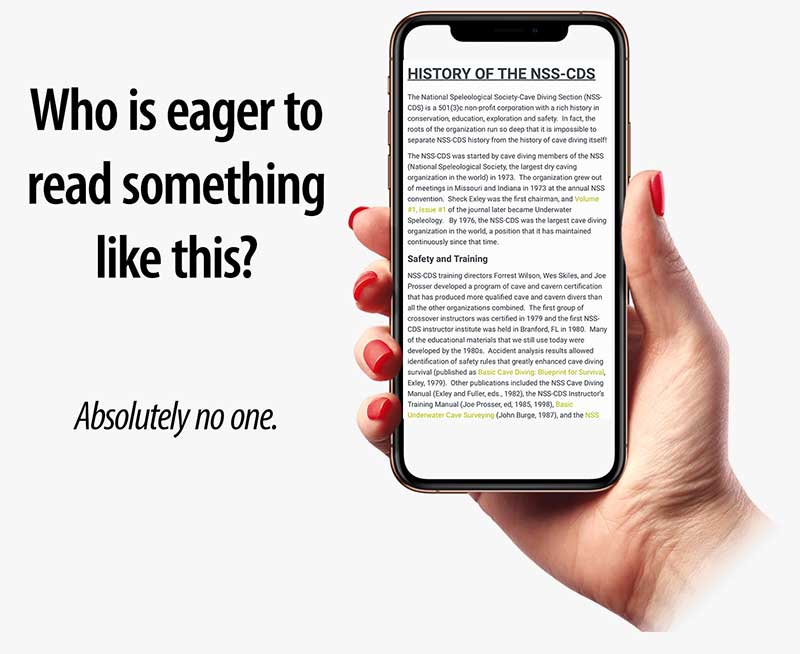
5 Too much unbroken text
Your website content can pass all readability tests with flying colors and yet still turn visitors away. How? By being arrayed in large blocks of unbroken text. This has become an even bigger problem now that over half of visitors are viewing your website on their phones.
What can you do to prevent this?
- Start by breaking large paragraphs into smaller ones of no more than two to three sentences each.
- Use bullet points whenever possible. These are proven to greatly improve both readability and comprehension.
- Have at least one subheading for every 300 words of text or less.
Want an example? You are looking at one right now.
By the way, we came across a website today in which the home page consisted of nothing but a lengthy treatise on why this business we absolutely the greatest of its kind. Was this necessary? No.
Visitors had already made the decision to come to the website. The home page should have served only to get them to the info they really wanted as quickly as possible.
Besides, we’ll bet no one other than the business’s owners ever bothered to read the home page.
6 Not enough imagery
Imagine if this blog post was devoid of images. If it was, there is a good chance you would not have gotten this far.
However, by using lots of imagery, we not only break up large blocks of text, but we also keep readers more engaged and help better underscore the points being made.
7 Inconsistent design
Other than the home page or any other landing pages, effective websites use a consistent header and footer design throughout. Additionally, blog posts and regular content pages each adhere to a consistent layout.
Violating this only serves to confuse visitors. They may have trouble following you and may even wonder whether they are still on the same website.
Remember the KISS principle. Keep it simple and consistent — and keep your visitors from going elsewhere.
8 Poor font choices and use
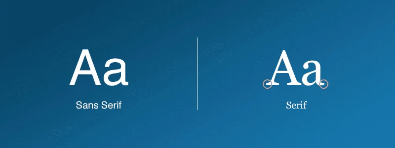
There are two basic categories of typefaces: serif and sans-serif.
- Serif typefaces are those in which the characters have “little hats and feet.”
- Sans-serif typefaces don’t.
Why is this important?
- Serif typefaces are the most readable way to put ink on paper — at least for body copy.
- In contrast, serif typefaces can be incredibly hard to read on computer and smartphone screens. Don’t use them.
Times and Arial are the typefaces most people know. Times is incredibly hard to read on digital media. Arial fairs better, but only in sizes above 20 pixels. There are better choices.
In 1995, Microsoft commissioned British type designer Matthew Carter to create two digital typefaces for the new Windows 95 OS. The results were the serif typeface Georgia and the sans-serif typeface Verdana.
- Georgia may be the only serif typeface that is actually readable on screen. You should still avoid it.
- Verdana is very readable on screen. Its only drawback is that it looks clunky in bold and in sizes above 18 pixels.
In 2011, Google created the Roboto typeface for the Android OS. It’s what you are reading right now. It’s not only the most readable digital typeface ever, it looks consistently good regardless of size or weight. It’s what we use on client websites and you should as well.
While choice of typeface is important, so is how you use them. Case in point:
- Use a consistent size and weight for fonts in both body copy, headings and subheadings.
- Don’t center text, not even for headlines. It looks amateurish and makes type harder to ready.
- To emphasize text body copy, use italics. Avoid boldface, ALL CAPS and underlining. This, too, looks amateurish. Additionally, if you underline text for emphasis, people will think it’s a hyperlink and become frustrated when clicking on it does nothing.
- Solid black text on a pure white background may sound boring but it is by far the most readable. The worst thing you can do is use gray type or place type on top of a busy background.
9 Poor color choices
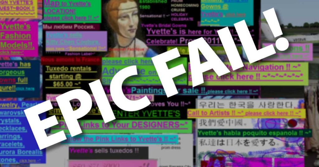
Nothing is more distracting than a website that is a nightmarish collection of competing colors.
Your website should use a consistent color scheme throughout. Soothing, complementary colors will help keep visitors on your site. Clashing colors will drive them away.
10 Not following conventions
Imagine trying to drive a strange car that did not have a conventional turn-signal indicator stalk on the left side of the steering column. Of which failed to follow conventions for things like windows and door locks.
The same is true of websites. Your visitors want your website to work the way they expect it to. Violating these conventions will only drive visitors away.
Among the conventions you want to follow:
- Have a distinct header and footer on every page except, possibly, the home page and any landing pages.
- Your primary navigation menu should appear at the top of every page, below the header.
- You can, and very possibly should put your phone number in the header. Past this, things like your address and hours can go in the footer.


