No one should have to tell you that a good logo will be the cornerstone of your company’s marketing efforts. The right logo will be distinctive and instantly recognizable. It will work in a variety of sizes across a wide range of platforms — especially in this era of social media.
So what makes a logo effective? Let’s find out.
Logo terminology
Before we start, let’s define two terms that are an integral part of logo design. These are logomark and logotype.
A logomark (also known as a brandmark)) is a distinctive symbol you want the public to associate with your business. The Nike “swoosh” and Amazon arrow are both examples of logomarks.
A logotype is your company’s name rendered in a distinctive font. Avoid using common typefaces such as Arial and Times for this. You want something unique — but very readable — for this.
Why you need both
Many of the logos we’ve come to associate with major businesses combine a logomark and logotype in a single piece of artwork. This used to work. However, in an era of social media, it has some serious drawbacks. We’ll explain shortly.
Another benefit of having both a logomark and a logotype is that you can arrange them as needed to fit the available space.
You’ve already seen how placing these side-by-side in landscape mode can work well for applications such as website banners.
However, having a separate logomark and logotype also affords you the flexibility to arrange them in portrait mode, if doing so better fits the available space.
You can also use these entities separate from one another, should the need arise. (More on this later.)
By the way, it’s important to have both color and black-and-white versions of your logomark and logotype. In digital media, you always have the luxury of using color. However, in print media, you may be limited to either black or a single color.
Many experts recommend designing the black-and-white versions of your marks first. Once you are satisfied with the single-color version, you can move on to the multicolor version. However, if you start with the color version, you may be disappointed when you see it rendered in black and white.
The right tool for the job
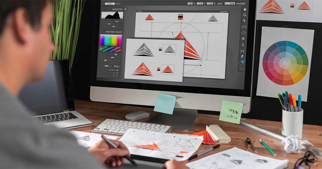
When designing your logo, it’s important to use a vector graphics application such as Illustrator rather than a bitmap application such as Photoshop. Why?
Vector images consist of a set of instructors for drawing lines and shapes. They are infinitely scalable up or down. You can upscale them for use on a poster, trade show display or billboard without any loss of quality.
Bitmapped images, on the other hand, consist of an array of pixels, like in a photograph. And while you can generally downscale bitmapped images without losing too much quality, if you try to make them larger than their original size, they pixelate. This makes the image soft and fuzzy — something you can ill afford.
Times have changed
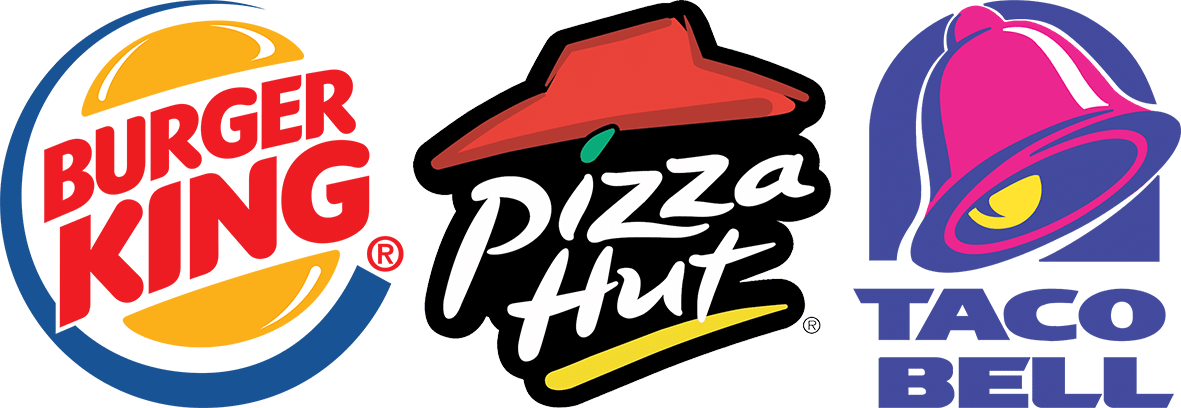
Here are the latest logos for three major fast-food chains.
You will see that, in each instance, the company name is integrated into the logomark. In the days before smartphones and social media, this worked. It no longer does.
If you look up these company’s on your phone, you will see that they are not even able to use these logos on their websites. Reduced to the size of your fingernail, they would not be readable.
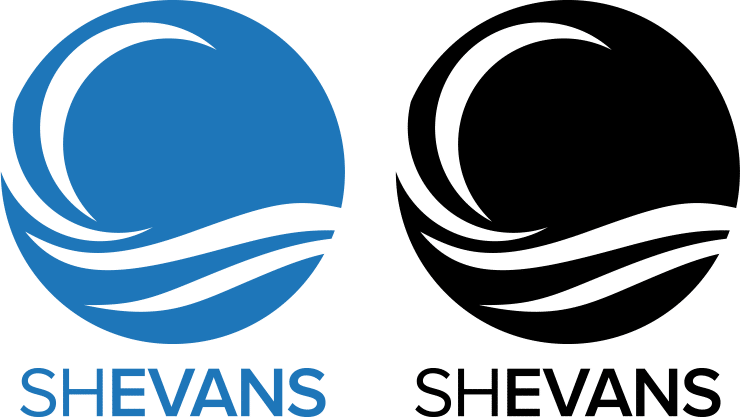
These days, social media plays a huge role in any company’s marketing efforts. In particular, you need a logo that will work well as a Facebook profile image.
Again, the fast-food restaurants are forced to use an out-of-date version of their logos for this. The SH Evans logomark, on the other hand, is a perfect fit.
When designing your logomark, make sure it is recognizable when used within the circular constraints of a Facebook profile image. This is why the simpler the design, the better.
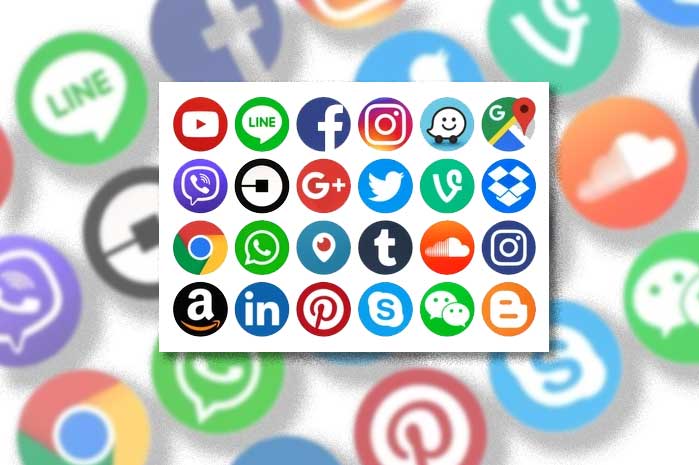
Here are the Facebook profile images for two dozen Internet technology companies. Even without the company logotype, you probably recognize most of them.
It’s interesting to note that all of these logomarks were designed after the advent of smartphones and social media.
Be consistent with color
Imagine what would happen if every McDonald’s manager was allowed to use whatever colors he felt like for the McDonald’s logo. This would severely diminish the value of the McDonald’s brand.
What this points out is that the distinctive orange and yellow colors we associate with McDonald’s are every bit as much of the company’s corporate identity as the golden arches that form the stylized M. In fact, if all you saw were some orange and yellow color swatches, you might think about McDonald’s without ever seeing the logo.
Most successful companies have a detailed logo style guide that not only specifies the precise colors to be used in both digital media and print, it also dictates the positioning of logo components relative to other elements on a website or page. You should create such a document for your new logo.
“Don’t throw the baby…”
Don’t throw the baby out with the bathwater. You’ve heard that before. It applies to logo design as well.
Everything you’ve read thus far applies to creating a new logo from scratch. But what if you have an existing logo that has gained widespread customer recognition? This is something you can’t afford to abandon.
Many successful companies have updated their logo at least once. What’s key is ensuring that anyone familiar with the old logo will instantly recognize the new one.
Case in point: An artist recently proposed the following update to the Wendy’s logo.
We don’t think this would fly. Consumers are simply too accustomed to seeing Wendy with pigtails. Besides, who wants to eat at a fast-food joint whose corporate symbol is an evil, redheaded Karen?
Sill, were the company to make this change, customers would likely have little difficulty associating the new Karen with the old Wendy.
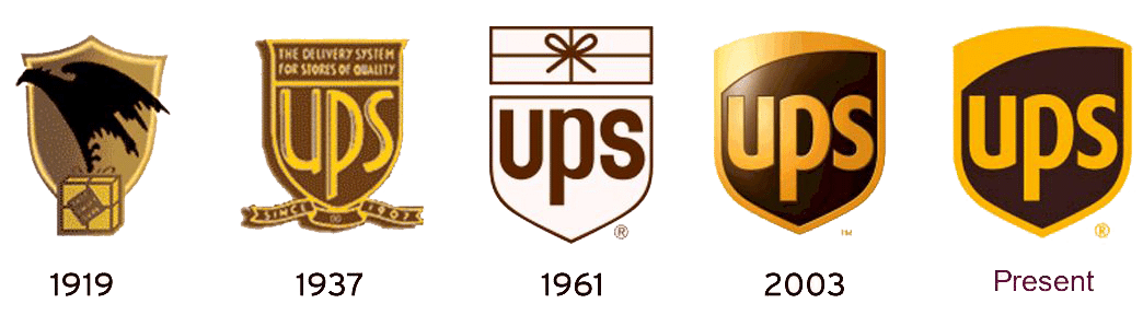
Here is a better example. It shows how the UPS logo has evolved over the years.
If you were familiar with the 1937 or 1961 versions of the logo, you’d have no problem recognizing the current version. The bottom line is, unless your current logo is absolutely horrid, don’t give up your brand recognition when updating it.
Don’t go it alone
As a business owner or manager, you are probably very good at what you do. It would be fair to say that no graphic designer could do your job as well as you do.
By the same token, however, unless you have a degree in graphic arts, you shouldn’t be designing your own logo. Some of the worst logos we’ve come across were designed by the company owner.
We’re sorry but a company logo is simply too valuable a commodity to trust to amateurs. A poorly designed logo can end up costing you thousands of dollars in lost revenue. Get professional help. It will more than pay for itself.
If you have questions about logo design or want help creating or updating a logo, contact us. It will be worth your time.